PullBack Alert
The Pull Back Alert indicator is based on the Volume Spread Analysis technique of chart analysis.
Volume Spread Analysis (VSA) is a form of technical analysis which attempts to look into price action in relation to volume. VSA is the study of the market forces of supply and demand and the manipulation of those forces through the psychology of crowd behavior, through examining the relationship between the quantity of volume on a price bar, the spread of the price or range of the bar, and the closing price on the height of that bar. Studying these variables establishes the equilibrium of demand and supply as well as the likely near term direction of the market.
Rediscover the Lost Art of Chart Reading
Using Volume Spread Analysis
Credit To: Todd Krueger
Most traders are aware of the two widely known approaches used to analyze a market, fundamental analysis and technical analysis. Many different methods can be used in each approach, but generally speaking fundamental analysis is concerned with the question of why something in the market will happen, and technical analysis attempts to answer the question of when something will happen.
There is, however, a third approach to analyzing a market. It combines the best of both fundamental and technical analysis into a singular approach that answers both questions of “why” and “when” simultaneously; this methodology is called volume spread analysis. The focus of this article is to introduce this methodology to the trading community, to outline its history, to define the markets and timeframes it works in, and to describe why it works so well.
What is Volume Spread Analysis?
Volume spread analysis (VSA) seeks to establish the cause of price movements. The “cause” is quite simply the imbalance between supply and demand in the market, which is created by the activity of professional operators (smart money). Who are these professional operators? In any business where there is money involved and profits to make, there are professionals. There are professional car dealers, diamond merchants and art dealers as well as many others in unrelated industries. All of these professionals have one thing in mind; they need to make a profit from a price difference to stay in business. The financial markets are no different. Doctors are collectively known as professionals, but they specialize in certain areas of medicine; the financial markets have professionals that specialize in certain instruments as well: stocks, futures, forex, etc.
The activity of these professional operators, and more important, their true intentions, are clearly shown on a price chart if the trader knows how to read them. VSA looks at the interrelationship between three variables on the chart in order to determine the balance of supply and demand as well as the probable near term direction of the market. These variables are the amount of volume on a price bar, the price spread or range of that bar (do not confuse this with the bid/ask spread), and the closing price on the spread of that bar.
With these three pieces of information a properly trained trader will clearly see if the market is in one of four market phases: accumulation (think of it as professional buying at wholesale prices), mark-up, distribution (professional selling at retail prices) or mark-down. The significance and importance of volume appears little understood by most non-professional traders. Perhaps this is because there is very little information and limited teaching available on this vital part of chart analysis. To interpret a price chart without volume is similar to buying an automobile without a gasoline tank. For the correct analysis of volume, one needs to realize that the recorded volume information contains only half of the meaning required to arrive at a correct analysis. The other half of the meaning is found in the price spread (range).
Volume always indicates the amount of activity going on, and the corresponding price spread shows the price movement on that volume. Some technical indicators attempt to combine volume and price movements together, but this approach has its limitations; at times the market will go up on high volume, but it can do exactly the same thing on low volume. Prices can suddenly go sideways, or even fall off, on exactly the same volume! So there are obviously other factors at work on a price chart. One is the law of supply and demand. This is what VSA identifies so clearly on a chart: An imbalance of supply and the market has to fall; an imbalance of demand and the market has to rise.
A Long and Proven Pedigree
VSA is the improvement upon the original teaching of Richard D. Wyckoff, who started as a stock runner at the age of 15 in 1888. By 1911, Wyckoff was publishing his weekly forecasts, and at the height of his popularity, it was rumored that he had over 200,000 subscribers. In 1931 he published his correspondence course, which is still available today. In fact, the Wyckoff method is offered as part of the graduate level curriculum at the Golden Gate University in San Francisco. Wyckoff is said to have disagreed with market analysts who traded from chart formations that would signal whether to buy or sell. He estimated that mechanical or mathematical analysis techniques had no chance of competing with good training and practiced judgment.
Tom Williams, a former syndicate trader (professional operator in the stock market) for 15 years in the 1960s-1970s, enhanced the work started by Wyckoff. Williams further developed the importance of the price spread and its relationship to both the volume and the close. Williams was in a unique situation that allowed him to develop his methodology. He was able to monitor the effects of the syndicate’s trading activity on the price chart. As a result, he was able to discern which resulting price gyrations derived from the syndicate’s action on the various stocks they were buying and selling. In 1993, Williams made his work available to the public when he published his methodology in a book titled Master the Markets.
A Universal Approach
Just as Wyckoff’s approach was universal in its application to all markets, the same is true of VSA. It works in all markets and in all timeframes, as long as the trader can get a volume histogram on the chart. In some markets this will be actual traded volume, as it is with individual stocks, yet in other markets the trader will need access to tick-based volume, as is the case with forex. Because the forex market does not trade from a centralized exchange, true traded volume figures are not available, but this does not mean that the trader cannot analyze volume in the forex market, it simply requires that tick-based volume be used instead.
Think of volume as the amount of activity on each individual bar. If there is a lot of activity on that price bar, then the trader objectively knows that the professional operator is heavily involved; if there is little activity then the professional is withdrawing from the move. Each scenario can have implications to the supply/demand balance on the chart and can help the trader determine the direction the market is likely to move in the short to medium term. A forex example will be shown later in this article. Just as VSA is a universal approach to all markets, this methodology works equally well in all time frames. It makes no difference if the trader is looking at a 3-minute chart, or if daily or weekly charts are being analyzed—the principles involved remain the same. Obviously, if supply is present on a 3-minute chart, the resulting downward move will be of a lesser magnitude than supply showing itself on a weekly chart, but the result of excess supply on a chart is the same in both instances; if there is too much supply, then the market must fall.
Why it Works
Every market moves on supply and demand: Supply from professional operators and demand from professional operators. If there is more buying than selling then the market will move up. If there is more selling than buying, the market will move down. Before anyone gets the impression that the markets are this easy to read, however, there is much more going on in the background than this simple logic. This is the important part of which most non-professional traders are unaware! The underlying principle stated above is correct; however, supply and demand actually work in the markets quite differently. For a market to trend up, there must be more buying than selling, but the buying is not the most important part of the equation as the price rises. For a true uptrend to take place, there has to be an absence of major selling (supply) hitting the market. Since there is no substantial selling to stop the up move, the market can continue up.
What most traders are completely unaware of is that the substantial buying has already taken place at lower levels as part of the accumulation phase. And the substantial buying from the professional operators actually appears on the chart as a down bar/s with a volume spike. VSA teaches that strength in a market is shown on down bars and weakness is shown on up bars. This is the opposite of what most traders think they know as the truth of the market. For a true downtrend to occur, there must be a lack of substantial buying (demand) to support the price. The only traders that can provide this level of buying are the professional operators, but they have sold at higher price levels earlier on the chart during the distribution phase of the market. The professional selling is shown on the price chart during an up bar/s with a volume spike, weakness appears on up bars. Since there is now very little buying occurring, the market continues to fall until the mark down phase is over. The professional operator buys into the selling that is almost always created by the release of bad news; this bad news will encourage the mass public (herd) to sell (almost always for a loss). This professional buying happens on down bars. This activity has been going on for well over 100 years, yet most retail traders have remained uninformed about it—until now.
VSA at Work
Let’s now look at a clear example of supply entering a market as the professional operators are selling into a rising market. Please see Figure 2 as we look at the U.S. dollar/Swiss franc spot forex market on a 30-minute price chart. This market was in the mark-up phase until the bar labeled 1; notice the massive volume spike as an ultra wide spread, up bar, appears with the price closing in the middle of the bar. This is a telltale sign of professional selling entering the market; a trader must look at this bar and realize that if all the activity shown on the volume histogram represented buying, we could not possibly have the price close on the middle of the bar. Because professional operators trade with very large size, they have to sell into up bars when the herd is buying; this is how they unload their large size onto the unsuspecting public. Many times, these types of bars are created from news reports that appear very bullish to retail traders and invite their participation on the long side of the market. When this occurs, it creates the opportunity for professional operators to systematically sell their holdings and short the market, without driving the price down against their own selling.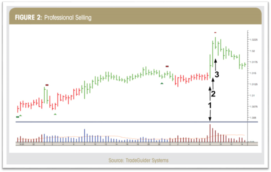
A properly trained trader understands instantly that when the bar closes in the middle like this, with massive volume, it signifies a transfer of ownership from the professionals to what VSA refers to as “weak holders,” traders that will soon be on the wrong side of the trade. Think of the analogy used earlier in this article; this is the professional operators “selling at retail” (distribution) when earlier they established their positions by “buying at wholesale” (accumulation). On the bar labeled 2, again we have more selling from the professionals as they complete the transfer of ownership to weak hands. The trained trader can see this as the bar labeled 3 is now closing lower, confirming that there was a large block of selling on the previous bar.
Don’t Be Part of the Herd
Let’s review what just happened on the price chart here. The professional money has sold their holdings to the mass public called the “herd” or “weak holders.” The professionals sold short and the new buyers are locked into a poor position. How can price continue higher when the professional money won’t support higher prices and there are no other buyers left to buy? With no buyers left to support the price, the price falls as the chart continues on into the mark down process (see Figure 3). To explain why prices fall in any market, let’s refer to a previous statement: “For a true downtrend to occur, there must be a lack of substantial buying (demand) to support the price. The only traders that can provide this level of buying are the professional operators, but they have sold at higher price levels earlier on the chart, during the distribution phase of the market.”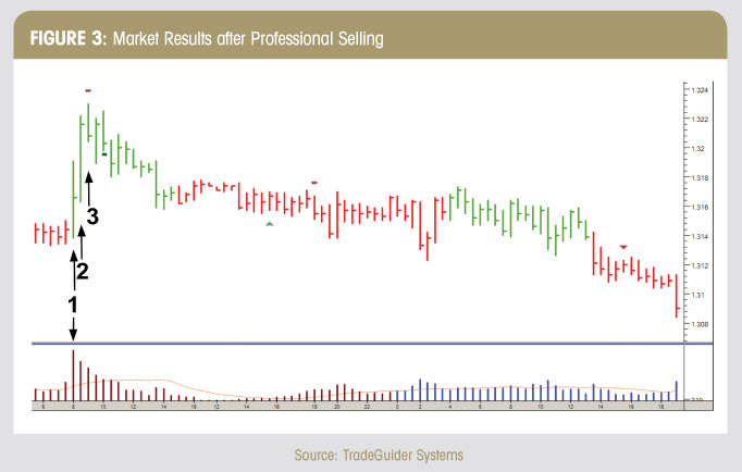
When the price falls far enough, the professional operator will now enter the market and buy (at wholesale levels) from the “weak holders,” who are forced to sell at a substantial loss, and the cycle will repeat itself over and over again. This is the way all markets work! Because professional operators specialize in many different markets and many different time frames, this same sequence of events unfold on price charts of all durations. We reviewed a 30-minute chart in this article, but it could just as easily have been a weekly chart. The market we looked at was forex, but volume spread analysis works just as well in stocks, futures and commodities. VSA is a market analysis methodology that alerts the trader to the two most important questions that they must know the answers to in order to trade successfully — why and when. Why markets move is based on the supply and demand from professional operators, and when they move can be expanded upon once the trader has a more thorough understanding of volume spread analysis.
HUD (Heads Up Display)
With all of our Intentional Indicators our attempt is to remove all extraneous information, and to put the information that we really need for making trade decisions right in front of us on our charts. This is the “HUD” or “Heads Up Display” approach we take with each of our indicators. This approach to developing our indicators creates much cleaner, neater charts and keeps the trader from having to look away from his or her target in order to make a good trade decision. It simplifies every trade decision so that they can be made quickly and accurately.
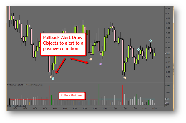
Figure 1 on the main chart area the PullBackAlert indicator has generated custom draw objects when the
conditions required to generate a signal are present. The histogram below is the PullBackAlertLevel indicator.
For our purposes, we are simply looking for an indication that price is showing a potential reversal or pullback from a trend according to an underlying set of data. It is not important to watch this data in order to determine if a condition does or does not exist. We simply need to keep our eyes on our charts and only the necessary information will be used to alert us to the fact that a condition exists. Therefore the need for multiple charts, monitors, computers, and indicators is greatly diminished.
PullBackAlert ships with 2 different indicators that can be applied to a chart.
- PullBackAlert
- PullBackAlertLevel
The first indicator will generate draw or text objects on a chart to indicate when a condition is present. This object will print on the close of the current bar only if the parameters that have been set indicate a positive condition is present, and will print either above or below the bar. If it prints above the bar, then a reversal or pullback sell (short) could be anticipated. If it prints below the bar, then a reversal or pullback buy (long) could be anticipated.
This indicator is the only one of the two included that we use in The Intentional Trader trade rooms. If a trader chooses, he or she could also add the PullBackAlertLevel indicator to the chart. To get an accurate picture of what is happening, it is important that the parameter settings of each indicator are identical to each other.
Parameter Settings
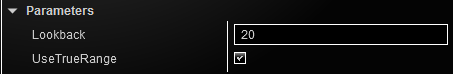
LookBack
The number of bars to look back to determine min/max values
UseTrueRange
Use the actual range of the bar or just the high/low of the bar.
Draw Bar Object Settings
The user has the ability to use any NinjaTrader drawing object such as dots, arrows, or triangles as well as using any text to customize how the indicator appears on the chart.
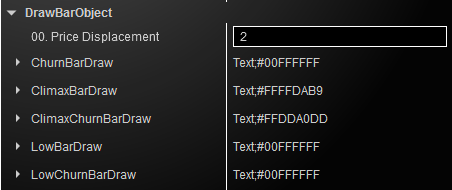
ChurnBar: Churn bars indicate profit taking, new supply entering the market at tops or new demand entering the market at bottoms
ClimaxBar: Climax Up bars indicate large volume demand that results in bidding up prices. Climax Down bars indicate large volume supply that results in pushing down prices.
ClimaxChurBar: A combination of the ClimaxBar and ChurnBar
LowBar: Low bars indicate a lack of demand at the tops or a lack of supply at the bottoms.
Price Displacement
This is the distance from the top or bottom of the bar that the draw object will print. The lower the number the closer to the top or bottom of the bar it will print.
*BarDraw Parameters
Click the “>” sign next to any of the BarDraw menu items to set the parameters of the drawing object that prints on the chart to indicate a positive condition.
This will open up some selections where you can choose the parameters of the look and actions of the draw object.
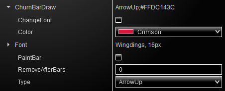
ChangeFont (see below, Using Fonts)
Color
Choose from any of the NinjaTrader default color selections
Font (see below, Using Fonts)
PaintBar
If you do not want to print a draw object on your chart, you can choose to have the entire bar or candlestick paint a color to indicate that a positive condition exists. Selecting this checkbox will override any other settings.
RemoveAfterBars
Number of bars after the bar on which the draw object printed that the draw object will be removed from the chart.
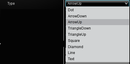
Type
Using Fonts
Select the draw object or “Text”.
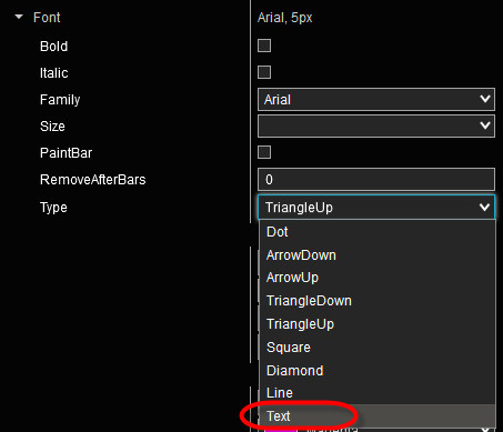
Steps required to change to a custom printed character:
For illustration, let’s say the user prefers a star rather than an arrow or other draw object. How do we display a star on the chart? Follow the steps below:
- To change to a new custom symbol, select “Text” in the PullBack Alert indicator settings under DrawBarObject.
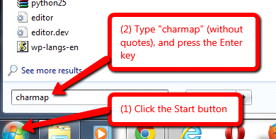
- To view and choose a character set, click on the Windows Start button. Type charmap and press Enter.
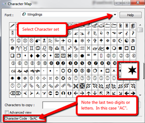
- This last step will bring up all the character sets available on the local computer. Browse through the options such as Webdings, Wingdings, or other graphical or text characters.
- For example, let’s say the user wants a star from the Wingdings set. Make a note of two pieces of information: (1) that it is in the Wingdings set; and (2) that the character code ends in “AC”.
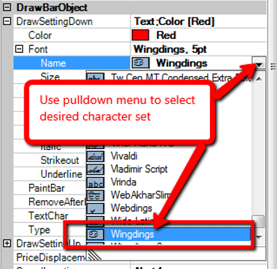
- Next, go back to the PullBack Alert indicator settings in NinjaTrader. Under Font Name, use the pulldown menu to select the character set from Step 4. For our example, we select “Wingdings.”
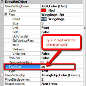
- From Step 4 above, type in the two digit or letter character code for the particular character that was chosen from the character set. This is entered in the PullBack Alert indicator settings under the TextChar settings as shown to the right.
In this example, we would type ac (not case sensitive) in the TextChar box in order to get the Wingdings star.
From here, the user can select the size and color of the chosen symbol.